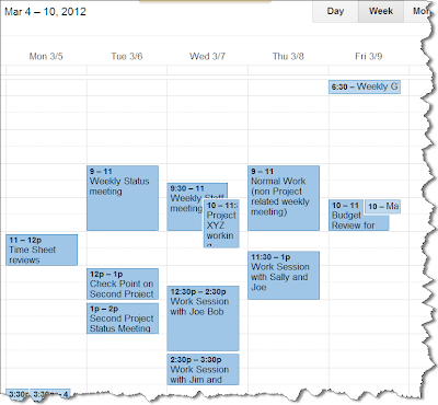
I have worked with multiple calendars over the years and the one thing that gets very difficult to manage is over crowding in my calendar view. Those of us with "normal" lives will be overwhelmed by all of the things that make their ways to our calendar. When you add Kids to the mix it's almost impossible to not get overwhelmed. So, When I'm managing projects and my life, I find it extremely helpful to use colors in my calendar and I think it will help you too.
It has been proven that the human brain works much faster when dealing with images and colors versus the written word. So let's do two things in your calendar to take advantage of our brain's natural ability to process vistual stimulas.
Define your colors by Categories:
When you're ready to assign colors to items in a calendar start thinking about how you organize your life. Then start thinking from the perspective of how you want to view things. How should things pop out to you visually based on similar colors. Just like you do in creating metrics for projects or reports for applications. Think about what you want your end result to look like when assiging details to the items that go into that result.
So as an example if I have a weekly status meeting that is in regards to a particular project I would think about using the same color for all of the meetings or items that are associated to that project
In the same sense I will look at recurring items vs. One off items with different shades as well.
So if I select a darker color for particular project, then within that I might use a lighter shade of that same color to represent one off (non recurring item) Depending upon your preferences, which is easier to read and stands out better. Thsi will help you in a weekly view to see which schedule is not usually in your calendar and where your focus is being applied.
In the below example you can see that I've chosen darker colors for my one of meetings and lighter colors for my recurring meetings. *note that this is Outlook view, you can do the same thing in Google Calendar as well as most calendar applications. You can rename any color category to your liking...
Now the reason I chose a darker color for one off vs. stand alone items is they stand out more. So the lighter shade represents something that is on a recurring basis the darker colors something to pop to make me remember that I need to do that is not something that's on my regular schedule. This has nothing to do with reminder pop ups and such, just a visual way to view my calendar.
Assign your Categories to your appt's:
Now that you have decided on your color scheme you can assign colors to your individual and recurring calendar items...
Once that is done, your calendar will start to look like this:
On a personal note, I do the same thing with my kids. Each get's their own color and shade according to child and activity (or sport) ... :)
vs:
I hope this helps you with your productivity and the organization of your Calendar. Until Next time...
This Blog is also posted on the PlanNet site: www.plannet.net


